

Best Stamped Concrete Color and Highlight Combinations
Have you ever walked on a patio that looked like natural stone but felt smooth? Or admired cobblestones, only to find they were concrete? Welcome to stamped concrete—where durability meets stunning design.
Stamped concrete transforms outdoor spaces. It offers the beauty of high-end materials without the high cost or upkeep. However, choosing the right colors and highlights can make or break your project.
Understanding the Coloring Process
Stamped concrete features more than one color variation. The best designs use a base color with accent colors, known as “highlights” or “release agents.”
Think of it this way:
-
Base color: The primary color of your concrete.
-
Highlight/release color: Secondary colors that add depth and dimension.
These layers work together to create realistic stone-like variations that impress!
Popular Base and Highlight Color Combinations
Let’s look at some of the best colors winning combinations that create stunning results:
| Style | Base Color | Highlight Color | Best Used For |
|---|---|---|---|
| Weathered Limestone | Buff/Tan | Charcoal Gray | Patios, Pool Decks |
| Rustic Slate | Blue-Gray | Charcoal Black | Entryways, Garden Paths |
| Tuscan Terracotta | Terra Cotta | Dark Brown | Mediterranean-style Homes |
| Natural Sandstone | Soft Beige | Rust Brown | Desert Landscapes |
| Classic Cobblestone | Medium Gray | Charcoal | Driveways, Historic Homes |
| Autumn Wood | Amber | Dark Walnut | Patios, Transitional Spaces |
| Beach Stone | Soft Sand | Slate Blue | Coastal Properties |
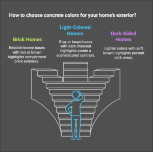
Matching Colors to Your Home’s Exterior
Successful stamped concrete mix designs complement your home’s colors. Here’s how to ensure your new coloring concrete fits with your property’s design:
For Brick Homes
Reddish-brown bases with tan or brown highlights harmonize with brick exteriors. The warm tones echo the brick while providing concrete stamping contrast.
For White or Light-Colored Homes
Gray or taupe bases with dark charcoal highlights make a classy antiquing contrast against light siding, creating a sophisticated final color palette look.
For Dark-Sided Homes
Lighter colors like tan or buff, with soft brown highlights, keep outdoor color stamped concrete project areas from looking too dark.
Key Takeaway: Always collect color samples from your home’s siding and trim and compare them to concrete samples before finalizing your choice.
Regional Factors That Affect Your Color Choice
Your location influences your color decisions—more than you might think!
Hot, Sunny Climates
In areas like Arizona or Florida, lighter colors reflect heat and stay cooler. A tan base with subtle terracotta highlights works beautifully.
Cool, Rainy Regions
In the Pacific Northwest or Northeast, richer colors resist moisture. Slate blue or gray bases with charcoal highlights resist stains and fit well with nature.
Desert Environments
Sand-colored bases with rust or brown accents match desert landscapes and help reflect heat.
Mike from Phoenix says, “We wanted dark brown stamped concrete designs in multiple colors, but our contractor suggested a lighter sandstone color.” Thank goodness we listened—the darker concrete would have been unbearably hot!
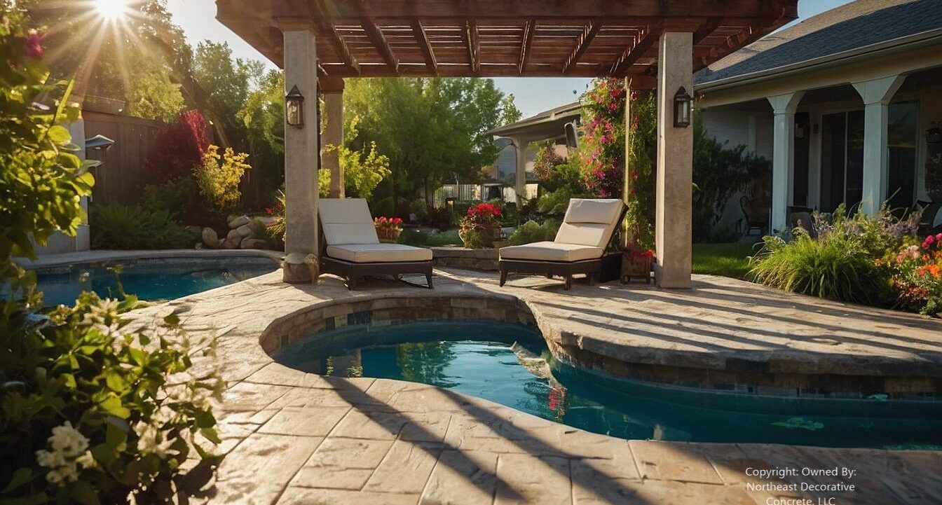
Case Study: The Homeowner’s Backyard Transformation
The homeowners wanted to update their outdated backyard in Chelmsford, Massachusetts. Their 1990s home had beige siding with dark green trim, which was challenging to complement.
The Challenge: Create an inviting outdoor space that would:
-
Match their home’s colors.
-
Endure Massachusetts temperature changes.
-
Look natural near the mountains.
The Solution: Northeast Decorative Concrete, LLC recommended a stamped concrete deck using:
-
Base Color: Warm tan with slight green undertones
-
Highlight Color: Deep bronze with hints of forest green
The Process:
-
The base color was mixed into the concrete.
-
After pouring, the highlight color was used as a release agent.
-
Ashlar slate stamps create a natural stone pattern.
-
A clear sealer enhanced the colors and provided protection.
The Results: The Massachusetts homeowners still love their sundeck three years later. It looks great and is the family’s top spot for gatherings. The colors subtly pick up the green from their trim while the warm tan balances the beige siding.
Pro Tip: Always ask to see actual photos of past projects with your color combo. Dried and cured colors can look very different in samples compared to un-cured large concrete areas.
Color Psychology for Outdoor Spaces
Colors affect our mood and how we perceive spaces. Here’s how to use this knowledge:
Earth Tones (Tans, Browns, Terracotta’s)
Create warm, inviting spaces that feel grounded. Perfect for cozy gathering areas.
Blues and Grays
Evoke water and sky, creating calmness. Ideal for relaxation zones.
Reds and Rusts
Stimulating colors creates energy. Use these where lively conversation is encouraged.
Greens
Connect to nature and promote growth. Great for garden-adjacent areas.
How Sunlight Affects Your Color Choice
Sunlight dramatically impacts how your stamped concrete appears.
Full Sun Areas
Colors look lighter and may fade faster. Choose slightly darker shades than you think you need.
Shaded Areas
Colors appear darker and more saturated. Consider going one shade lighter for shaded sundecks.
Partially Shaded Areas
This situation is tricky! Select neutral mid-tones that won’t look too dark or too light.
Common Color Combination Mistakes to Avoid
Even well-intentioned homeowners make these errors:
-
Too little contrast creates a flat look.
-
Too much contrast can make concrete look busy.
-
Ignoring landscape colors can disconnect your concrete from its surroundings.
-
Choosing trendy colors over timeless ones can backfire.
-
Matching colors precisely to your home instead of complementing them.
Step-by-Step Guide to Selecting Your Perfect Combination
-
Gather inspiration from your home’s colors and surrounding landscape.
-
Determine the style you want to mimic (slate, flagstone, cobblestone, etc.).
-
Consider your climate and its effect on color performance.
-
Collect physical samples of concrete colors (never choose from digital images alone).
-
View samples at different times of the day to see the effects of sunlight.
-
Look at previous projects using your chosen combination.
-
Request a small test patch before committing to the entire project.
Key Takeaway: Take your time selecting colors. This decision impacts your property’s appearance and value for decades.
Trending Colors for Stamped Concrete for 2025
While timeless choices are often safest, these trending combinations offer fresh ideas:
Modern Minimalist
Light gray base with subtle white highlighting—perfect for modern styles.
Natural Evolution
Soft green-gray base with limestone highlights—mimicking moss-covered ancient pathways.
Industrial Chic
A dark charcoal base with metallic bronze highlights creates an urban look.
Desert Modern
Warm sand base with copper and rust highlights—great for Southwestern homes.
Maintenance Considerations by Color Choice
Your color selection affects more than looks—it impacts stamped concrete maintenance, too!
Light Colors
It shows less heat damage but quickly reveals dirt and stains. It is ideal for hot climates but requires frequent cleaning.
Dark Colors
Hide dirt better but show more white salt deposits (efflorescence) and may get hot in the summer.
Mid-Tones
They often hide dirt well. They also stay calm and do not show much efflorescence.
A Windham, New Hampshire contractor says, “I always recommend medium-toned concrete surface bases. This is especially good for clients in places with distinct seasons. They perform best year-round with minimal maintenance.”
DIY Color Enhancement for Existing Stamped Concrete
Is your stamped concrete looking faded? You might not need to replace it! Consider these options:
-
Concrete staining adds new color to existing surfaces.
-
Tinted sealers combine protection with color enhancement.
-
Color hardeners refresh worn areas while strengthening the surface.
-
Concrete dyes offer vibrant color options.
Pro Tip: Always test color products on an inconspicuous area first to ensure you like the results.
The Environmental Angle of Base Color Selection
Your color choice affects the environment!
Energy Efficiency
Lighter colors reflect heat, potentially reducing cooling costs in the summer.
Heat Island Effect
Urban areas suffer from heat retention. Choosing lighter concrete helps to reduce this effect.
Longevity
Colors that last in your climate cut down on replacements and chemical treatments.
Bringing Stamped Concrete Color All Together
Selecting the right decorative concrete texture hue color mixture isn’t just about looks. It’s about making lovely outdoor spaces that boost your life and property value.
The best combinations consider:
-
Your home’s existing colors.
-
Your regional climate.
-
The look you want.
-
Practical maintenance concerns.
-
How the space will be used.
Choose an integral color base and highlight colors that match your home. Consider practical factors, too. This way, you’ll create beautiful outdoor spaces to enjoy for years. Planning a new patio, driveway, or walkway? These color tips can help you succeed with decorative concrete!
Our Locations:
Nashua, NH
North Hampton, NH
Concord, NH